8 tips for tinting paint
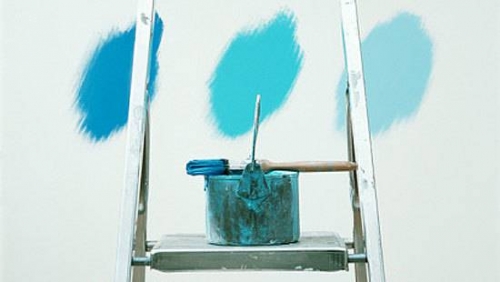
Modern trends in interior design are becoming more popular every day. And you can see that the most frequent decision on the design of the walls in this case is their painting. Firstly, it is very practical. Especially if you are used to frequent changes of scenery. After all, a painted wall can easily be repainted in a different shade at any time and with little or no special preparation. Secondly, sometimes staining is a more affordable type of finish than the same wallpapering, prices for which can sometimes be discouraging. Of course, savings can only be achieved if your walls are perfectly straight. Otherwise, you have to spend money on their alignment.
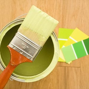
Be that as it may, those who prefer paint to other types of finishes may encounter such an unpleasant moment as the lack of the desired shade among the finished compounds. But this is not a reason to abandon your idea. Simply find the right shade in the palette of possible and mix the color and base in the given proportions. In this article we will give 8 tips for tinting paint, we will tell you exactly which compounds can be tinted and give examples of proportions to obtain the most original and sought-after shades.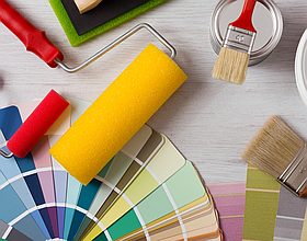
Varieties of color in composition
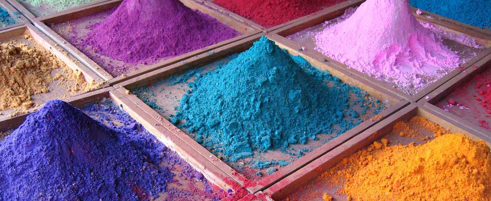
Probably, each of you in theory represents how the process of giving the usual white paint the necessary shade occurs. The main thing in this matter is to choose the appropriate type of color, which is a concentrate of a certain color. Depending on the added amount of this composition, the saturation and intensity of the final color of the paint will change. By the way, the technology for creating a new shade has two names that imply completely different actions:
- Tinting, which we are going to talk about today is when the pigment is added to the base of white in order to obtain one of the possible tones of the color. In this case, the saturation depends on the amount of pigment in the composition;

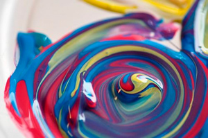
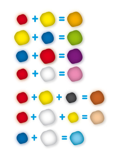
- Glaze - when two or more colors of the tint are mixed with the goal of obtaining a new, third color. For example, when they mix blue and yellow to get green. In this case, only colorants can be mixed first, and then the resulting mixture can be added to the white base to obtain a less saturated tone. It is rational to do this when there is no color scheme of the desired color, or when there are remnants of two colors on hand that, when mixed, give the desired result.
All colors, depending on the origin of the pigments in their composition can be divided into two types:
- Organic
- Inorganic.
In the first version, the color will have a more saturated, juicy and bright shade, which, of course, is an advantage. Their color palette is very wide. However, the finished paintwork based on such a color will have low light fastness that is, very quickly fade in the sun and lose its spectacular original color. In addition, if the paint is applied over a mineral-based plaster that releases a small amount of alkali, this will adversely affect the coating.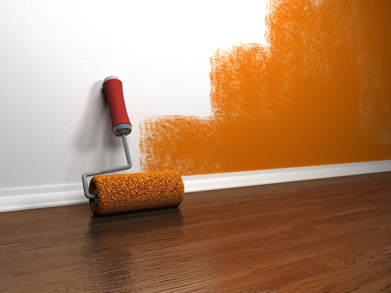
Color inorganic origin more resistant to ultraviolet radiation and retain their original shade for a long time. But in comparison with organic pigments, the resulting tones will be as if muted and less concentrated. And the range of possible colors will be more limited.
Based on this, many recommend choose the first type of colorants, if artificial lighting will prevail in the painted room. And give preference to the second type of color, if you plan to paint light, filled with natural light for almost the entire day, rooms.
Types of colors by release form
The whole variety of colors can be divided into three large groups depending on the form of their release:
- Powder - are the most affordable. Please note that with the help of a dry pigment, only water-based coloring compounds can be tinted. The palette of possible colors is very limited. Also, powdered dyes are not very convenient to use in terms of calculating the exact dosage. If you do not use special measuring spoons or weights, you will never know how much color you have added. Another disadvantage is poor solubility. To obtain a truly uniform color composition throughout the entire depth of the tank you need to mix very carefully and continuously;
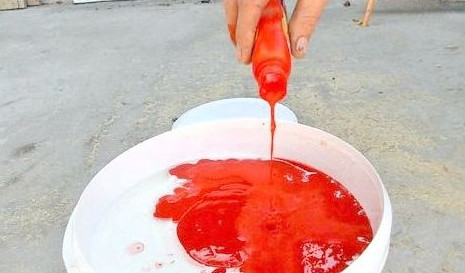
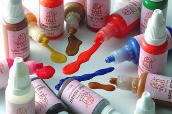
- Liquid or color paints - can be sold in tubes, small jars, bottles, plastic buckets or tubes. Such paint is very saturated and concentrated. With this composition, you can safely paint the wall without dilution. This is especially true if necessary to achieve the maximum bright shade, for example, with accent wall decoration. Liquid colorant is more convenient and controlled at a dosage. Usually count the number of drops. More convenient will be containers with thin, cone-shaped spouts;
- Pasty - the most popular and common. The advantage of color pastes is the ability to obtain a soft, close to natural shade. They are also quite easily mixed with a building whisk and are convenient in dosage.
Compatibility of colors with various types of paints and other compositions
Many often have a question whether it is possible to tint this or that type of paint composition and if so, which one is the best to choose a color. We decided to clarify this issue:
- If you need give special shade of varnish or primer compositionintended for application on wooden surfaces, it is worth using a color in the form of a paste or color paints;
- For all varieties of coloring compounds water based there are specialized colors such as “Faydal” or “Colorex”, the packaging of which indicates their compatibility with this type of LCS. Most often these are liquid concentrated pigments;
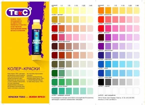
- For tinting alkyd paints will be more suitable pastes, for example, "Interior Facade", "Tex", "Olki", "Inzhsintez", "Unisistem";
- It is also permissible to add the above colored pastes to whitewashing;
- Universal pastes are also produced, with which you can tint polyurethane, epoxy, organosilicon and nitrocellulose enamels. These include "Elast-Color", "Professional", "Polymer", "Unikoler", "Monicolor";
- With almost all varieties of paints, colorants can be mixed with glitter - pearl or metallic.
As you can see, in this way, we can safely say that you can tint almost all varieties of paints and varnishes and even primers and varnishes. In addition, many designers when creating coatings from decorative plaster pigment is added directly to the composition.
But do not think that color can be added to the base in unlimited quantities. It is fraught with two unpleasant consequences - the final shade may become too saturated after the paint has stood a little and you have to either come to terms and take on what happened, or go for a new portion of white paint. Or, the coloring composition may lose its adhesive properties and will unevenly lie on the base or slide. 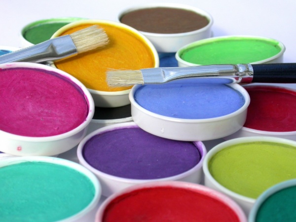
Adhere to basic rules:
- The volume of color added to water-soluble paints should not exceed 20% of their volume;
- For oil paints, this figure should not exceed 1.5-2%;
- For all other paints and varnishes - not more than 5%.
Then the resulting composition will be suitable for use, and the integration of the pigment does not affect its properties.
Manufacturers Overview
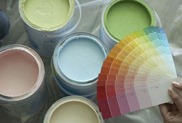
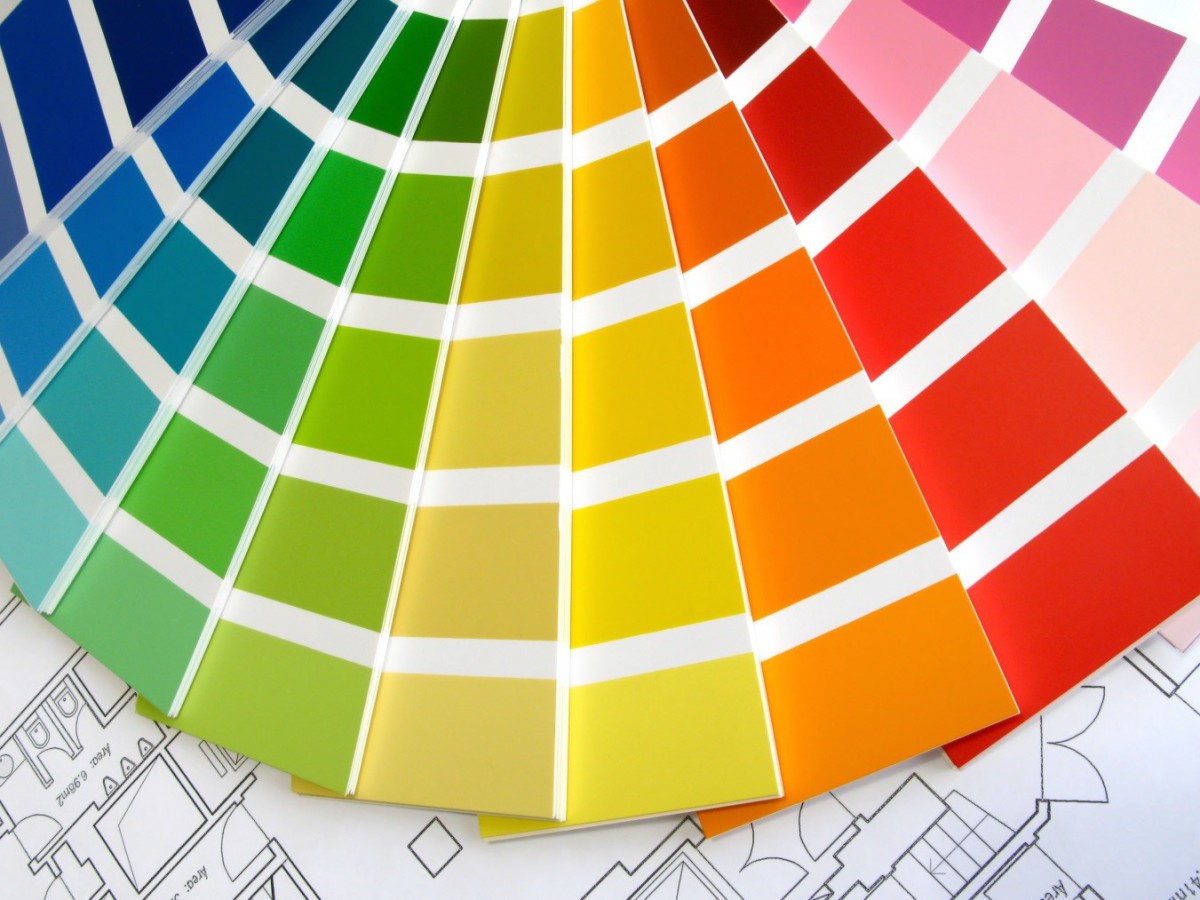
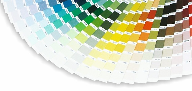
Often you can find the concept “Tinting systems " which can be misleading by its name. In fact, this is nothing more than the usual palette of possible shades that can be obtained by mixing the base paint and color of one or another manufacturer.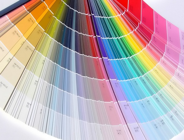 Each manufacturer has the same color, for example, regular red, may differ in tone or temperature. Pay attention to this moment. Also, in an ideal embodiment, it is advised to choose the base and color of the same company for a 100% hit in color and get exactly the shade that is drawn in the palette. It is noteworthy that, despite the fact that with the help of different colors you can get up to 15,000 new interesting shades, the tinting systems of different brands have a clearly limited number of possible tones. Consider Most Popular:
- The well-known company "Tikkurila" offers consumers its own tinting system called "Tikkurila Symphony." The palette includes no less than 2256 shades, among which you will find about 10 different shades of white. The system involves the tinting of interior household and general construction paints. To give the necessary shade to the facade paints, there is a separate system called “Tikkurila Facade”, which includes 232 tones;
- One common tinting system is Natural Color System, which is based on the use of six primary colors. In addition, each color has its own letter designation. Black - S, white - W, yellow - Y, red - R, Green - G, blue - B. All shades derived from these colors have their own encoding, consisting of letters and numbers, where the letter denotes the color and the number its percentage in the composition;
- One of the domestic manufacturers of colors, whose quality is not inferior to foreign, is a company Aqua Color. The company specializes in the production of tinting paints and pastes, compatible with alkyd, oil, water-based paints, cement and lime mortars and grouting compounds;
- A line of pigments called Unicolor from the manufacturer “Olki” is intended for use with alkyd paints, enamels, varnishes, water-borne primers and paints, adhesive and whitewash, oil-based white paints, epoxy and melamine alkyd compounds;
- Tinting paints "Dali" from the Moscow company Rogneda are suitable for use as an independent coloring composition, for water-dispersion paints, plasters, enamels. This line of pigments has increased light resistance, weather resistance, a wide palette of possible shades and high adhesion to the base surface.
Ways of tinting LKS
After you familiarize yourself with the possible varieties of colors and their compatibility with different compositions, you need to understand how the process of tinting the paint itself can be performed. Of options Total two:
- In a mechanical or automated way;
- By hand.
Obtaining the desired shade in the first case occurs on specialized equipment, which is controlled from a computer.Such machines can be found in professional stores that sell exclusively paintwork materials or in major construction markets.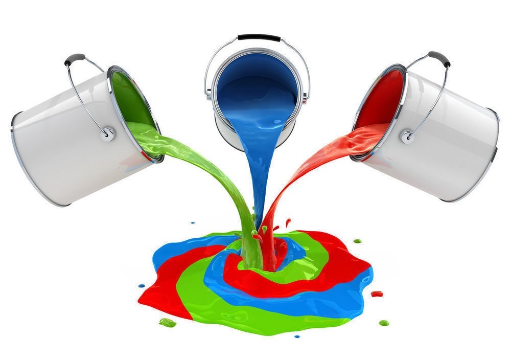 Process happens as follows:
- You select the desired shade from the palette or from the color spectrum in the program, which is the control for the mixing equipment;
- Each shade has a clear composition and strict proportions;
- After this, you need to set the desired amount of finished paint;
- Based on these data, the computer calculates and the tinting process itself takes place;
- As a result, you get a guaranteed shade.
This method is undoubtedly very convenient. First of all, by the fact that if in the end you did not guess the right amount of paint and you just didn’t have enough, you can always go back to the store and make an additional order. This eliminates the difference in shades of the new composition with that obtained before. 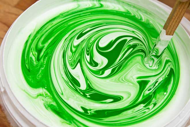 Although, to be honest, this statement, personally from me, raises some doubts. After all, even the manufacturers of pigments and base paints always warn that the tone of the same color but different parties may differ. So, the tinted composition will have differences? Question…
TO disadvantages this method can be attributed to:
- Additional costs, because this service is not free;
- The inability to tint directly on the object and on the spot to assess the necessary intensity of the shade. But this is very important, since a small shade square in the palette may not be perceived at all like the whole wall painted with this color.
Manual tinting is a more painstaking process, but there is nothing complicated about it, and you can do it yourself. This method has only one negative point:
- It is very likely that you will not be able to repeat the prepared shade in case you do not have enough paint.
But the benefits much more:
- Firstly, it is absolutely free;
- Secondly, you can always first prepare a small amount of the composition in place, work out, paint a small fragment of the wall with the resulting color and sensibly evaluate the result. And most importantly - make an adjustment on time. And that's exactly what I recommend doing, but more on that later;
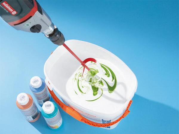
- And thirdly, you do not need specific equipment. Just a clean, preferably glass container, wooden stick, drill and a nimbus nozzle, a measuring cup and a syringe without a needle.
Step-by-step instruction
The tinting process is not complicated, you just need to adhere to the main rule - do not rush. Many do the same thing. mistake which leads to unnecessary additional spending - immediately add a large amount of color, and then begin to mix the composition. Naturally, in the vast majority of cases, the result will be unpredictable.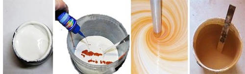 We will act carefully and clearly:
- To begin with, we will prepare all the necessary tools that we talked about in the paragraph above;
- We will prepare a working corner for ourselves - with a floor covering, if it already has a top coat, since it is best to breed the paint in the room for which the shade is selected;
- We will begin work with the preparation of the so-called probe, that is, a small amount of tinted paint. At this stage, our task is to determine the proportions and feel the mixing process itself. After all, the paint should be painted evenly and have a holistic structure;
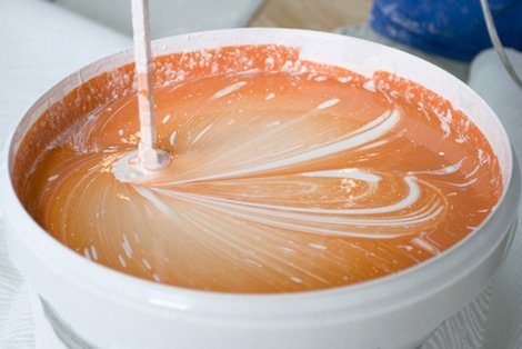
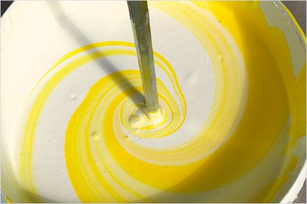
- To prepare the probe, pour a small amount of white paint into a clean container. Many do not write this, but it is best to use a measuring cup so that you do not guess later, but how much was the basis. After that, draw a small amount of tint into the syringe without a needle. Add the pigment to the base dropwise, mix thoroughly and only then, if necessary, add the next drop of dye. You may not notice this by eye, but believe, with every new drop the shade really changes;
- When, after mixing, the hue is approximately similar to what you want, stop. The fact is that the cooked composition should be a little lighter than the one you imagined. This is due to that feature, then on a large surface, the tone may already be quite saturated;
- Calculate how many tick marks on the color syringe you used. Write down the volume of the base and color on paper;
- Now you need to make a test stain. This will help to understand whether this is really the shade that is needed;
- To do this, you do not need to paint the floor of the wall. A small fragment is enough. Literally 40 × 40 cm. Do not select a section of the wall in the corner or near the floor. In such places, the hue will always appear darker;
- Color the square at the level of your eyes. And do not be afraid if something does not suit you, you can always cover it with the next layer of paint;
- Now you need to evaluate the result. Do not hurry. Look at the square from different angles. Also see how the color looks under different light sources. Turn on the overhead light, floor lamp, all together, turn off the light. It is advisable to work in the middle of the day when there is enough natural light in the room to appreciate the influence of all possible light sources. If time permits, leave the paint on the wall until the next day. In the evening, everything can appear very differently;
- If work is postponed until the next day - tightly close all containers and place them in a dark place;
- Suppose the next day the shade is still pleasant to you, so you can safely prepare the working staff. It is very important to dilute to tint the paint with a small margin, just in case;
- When cooking, use the already available proportions. For example, you diluted 5 drops of tint in 100 ml of the base. So for 1 liter of paint you need 50 drops. But this does not mean that you need to add all 50 drops at once. Add 45, mix thoroughly with a whisk, look, add 3 more drops, mix, and only then add the rest of the color and mix again.
As you can see, nothing complicated, just a little patience and zeal.
Little tips
Some important points to be sure should be considered with self-tinting:
- Choosing paint and color from the same manufacturer is recommended for a reason, stick to this recommendation;
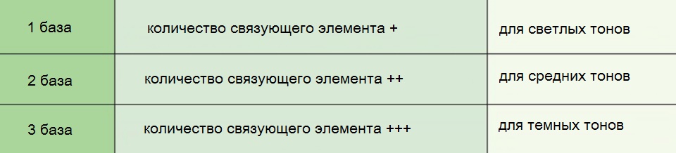
- An interesting fact is that, in fact, the amount of binder in the base paint is responsible for the possible intensity during tinting. The more it is, the more saturated and darker you can get a shade. Therefore, when choosing a paint, you must pay attention to this;
- Most often, white paint is used as the base. And not just white, but snow-white. If you find it difficult to determine the degree of whiteness by eye, use a simple test. Put a piece of paper next to an open paint can or with the corresponding white color in the palette. If the paint is darker, yellower, grayer it does not fit. Only whiter, or the same shade. Otherwise, when mixing, a yellow or gray shade of the base may affect the final result. And instead of, for example, purple, you get dirty pink;
- When you will evaluate the result of test staining under different lighting conditions, it is desirable that the light source be exactly the one that will be used in the future in this room;
- The color applied to the wall will always appear more saturated than on the sample. And in the corners it will appear darker, this is normal;
- If you have not used the entire volume of the tint, you can dilute it in a small amount of water, tighten it tightly and put in a dark place. In this form, pigments can be stored for up to 5 years;
"Recipes" of the most popular shades
Now in interiors of modern homes, you can find the most different and the most daring shades. It happens sometimes - you look at the color and think how did you get it? We give example the most noble shades and their composition in percentage:
- Royal red - Add 5-10% cold blue to the red base of cold red. You can experiment with the same content, but with warm colors;
- Tomato red - easy to obtain by adding 5% yellow and 5% brown to the base red;
- Crimson - its base is blue in which 1-2% of white, brown and red are added. If the intensity is insufficient, add again a small amount of auxiliary colors in equal shares;
- Olive - 10-20% yellow is dissolved in the green base, depending on the desired saturation;
- Turquoise green - in the base of the standard green color add no more than 20% of the blue color;
- Bottle green - obtained by mixing yellow and 20-40% blue;
- Turquoise blue - easy to obtain by adding 10-15% green to the standard blue;
- Royal blue - This chic shade is obtained by adding 10-15% black and 2% green to the blue base;
- Deep Navy - it turns out as a result of adding 5% black and 2% green to blue;
- Golden brown - to give the effect of radiance, add 10% blue, 10% white, 10% red to yellow. Moreover, the greater the percentage of the yellow base, the higher the contrast;
- Mustard- 5% black, 5% red, 1-2% green should be added to the yellow base;
- Noble pink-gray color - obtained by adding to white up to 5% black and up to 5% red;
- Blue gray tint - It turns out when 5% light gray and 1% blue is added to the white base. With the same proportions, but with the addition of green instead of blue, they will give a gray-green tint;
- Lemon yellow - A bright and positive color is obtained when 5% white and 1-2% green are added to standard yellow. Moreover, if the base yellow is a warm shade, then the resulting color will more give to yellowness;
- Aquamarine - can be obtained by adding to the white paint 35%, no more, green and 5% black;
- Royal purple - obtained by adding to the red base in small amounts and in equal proportions of black and blue until the desired level of saturation is obtained;
- Burgundy - add from 5 to 10% of each color in the red base, but in equal proportions - yellow + brown + black;
- Plum - A wonderful shade is obtained by adding 10% black, 10% blue and 5% white to the red base.
All of the above is bright an example the process glaze. After that, the resulting shade can be used either as an independent composition, or as a color, which is customary to breed in a white base.

 Wallpaper for painting: types and techniques of painting
 Coloring heating radiators: choice of paint ...
 How to prepare and paint the walls, which ...
 5 tips for grouting tiles
 Liquid wallpaper: properties and application
 7 tips for choosing a paint thinner
 6 tips on which parquet varnish to choose
 How to paint the OSB plate outside and inside the house: 8 tips
 7 tips for choosing slate and magnetic paint for walls
 Serpyanka-based wallpapers: selection, sticking and painting